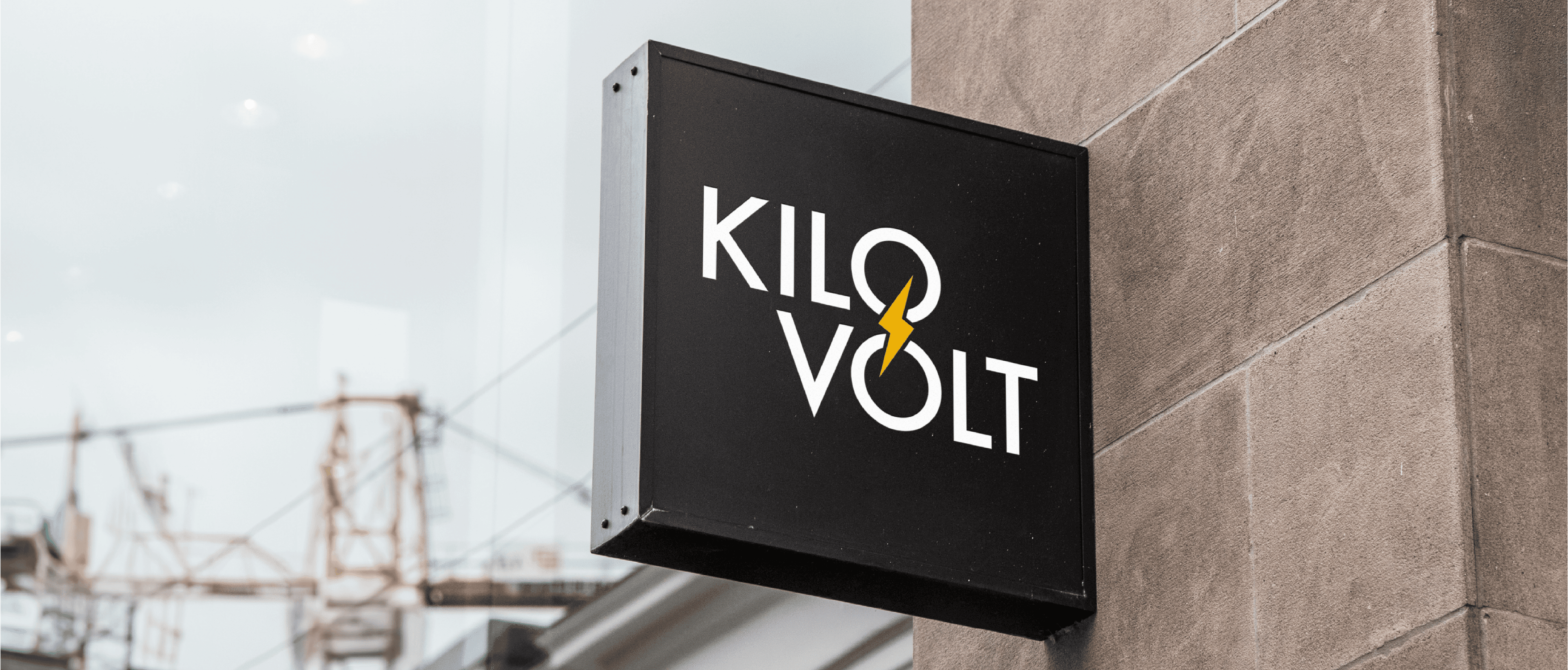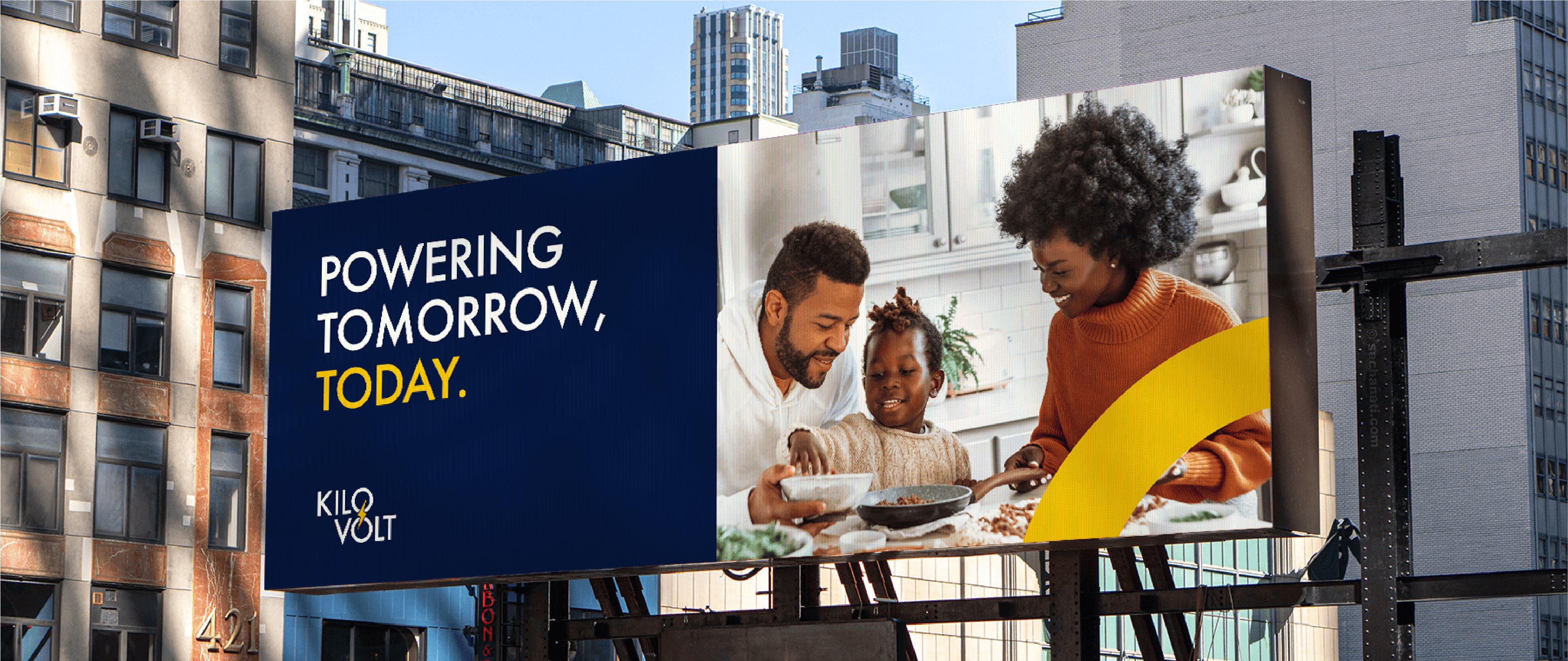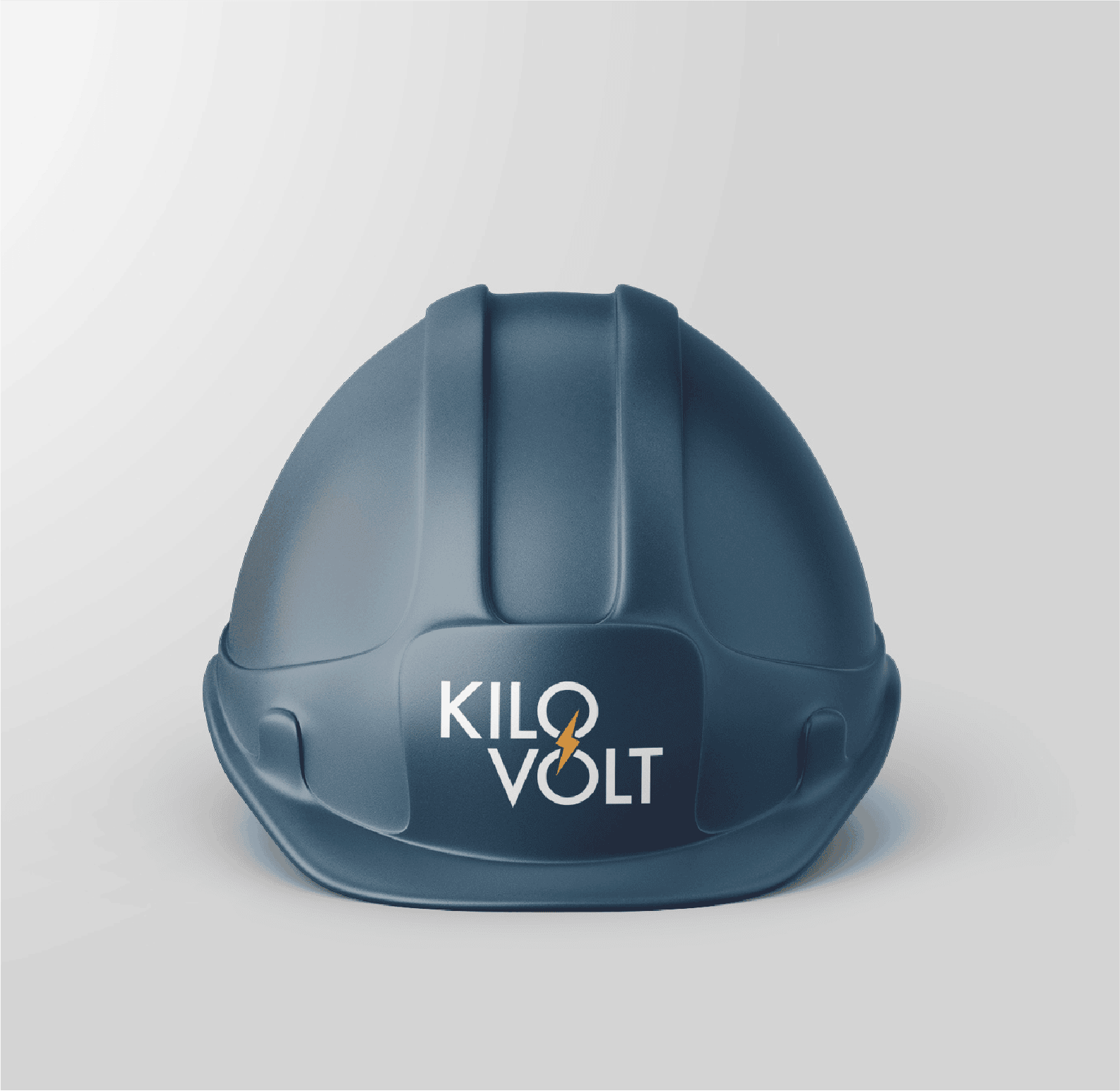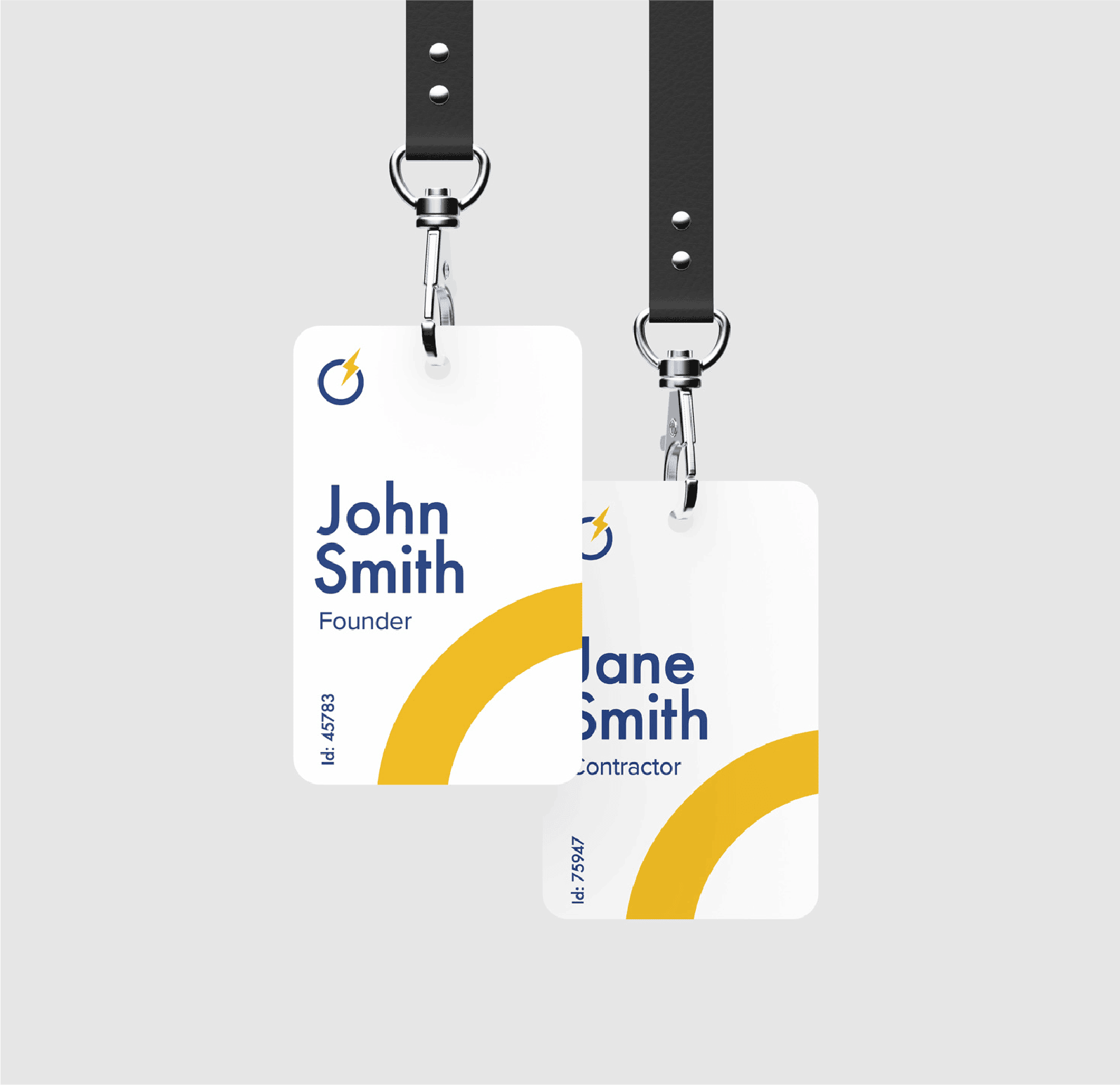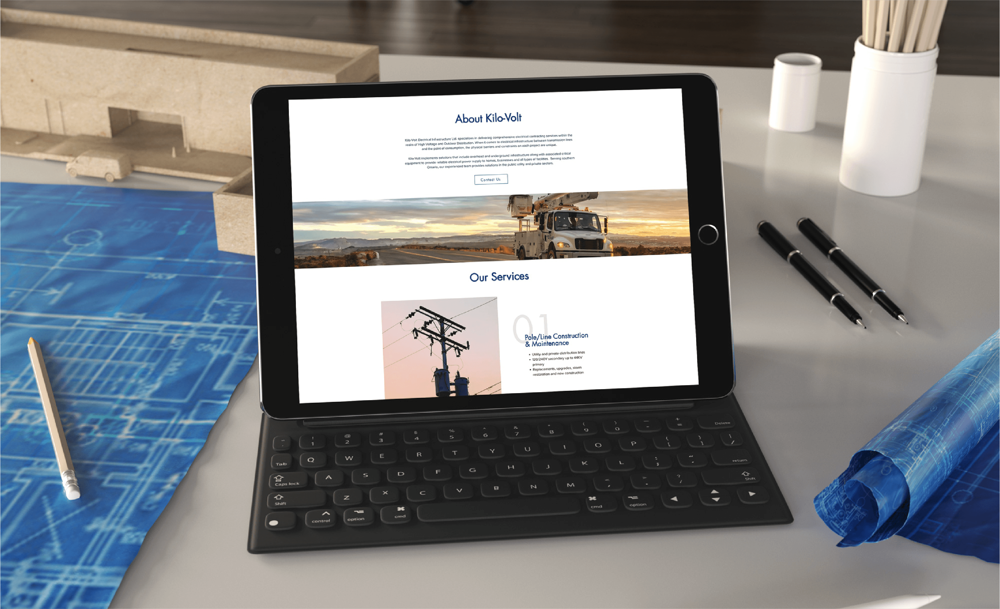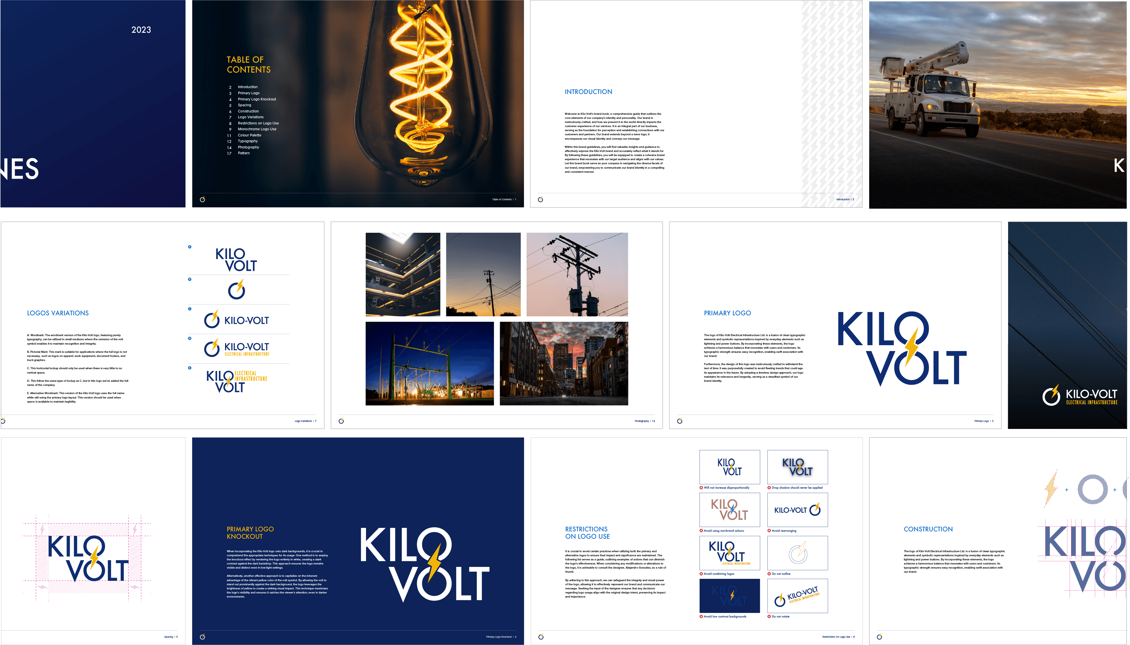

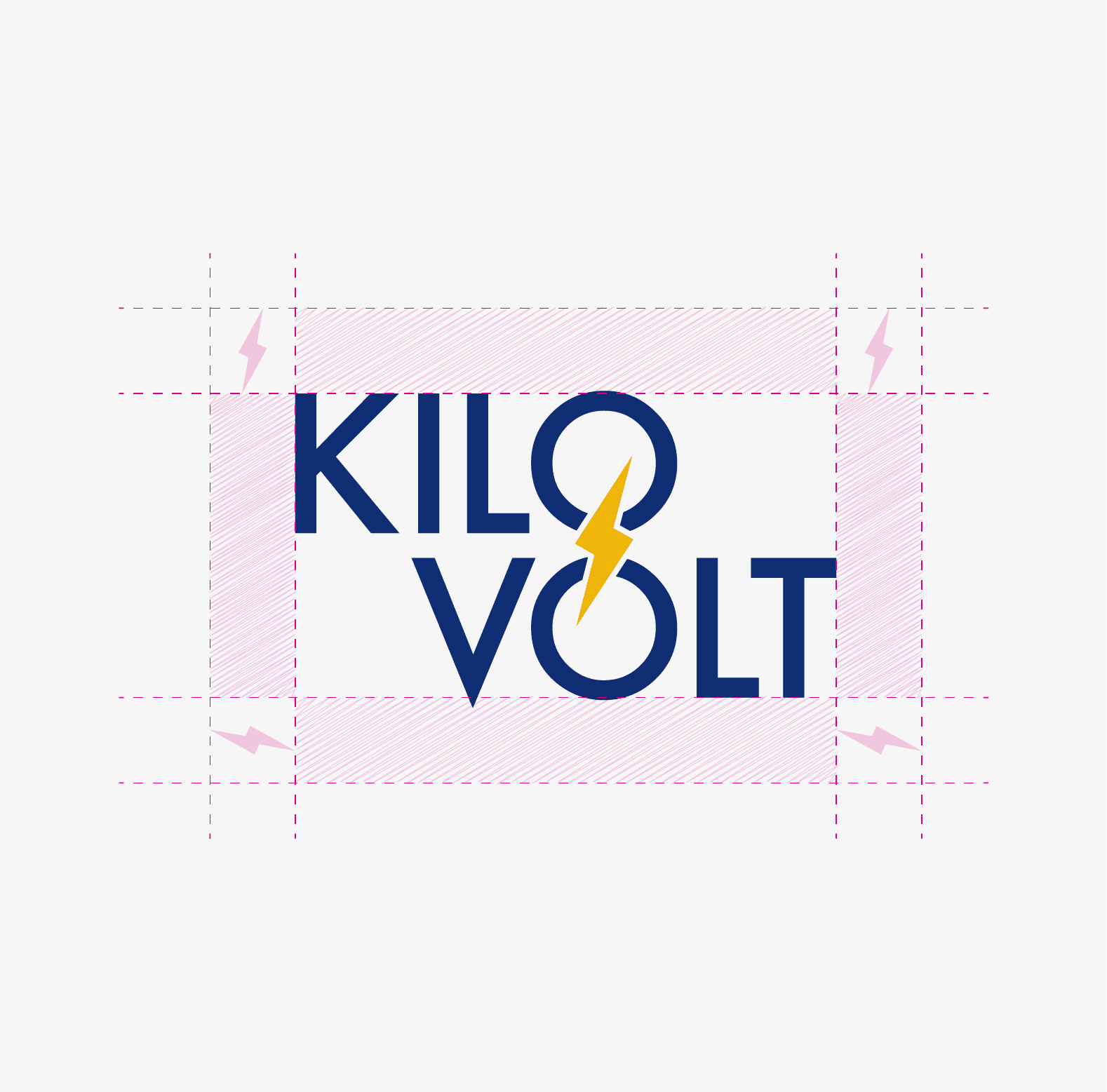
This brand identity was crafted with a deep sense of thoughtfulness and attention to detail, reflecting the essence of the client's high-voltage expertise. I infused electrical elements into the design, such as lightning motifs and circuit-inspired patterns, to symbolize the power and precision at the heart of their work. The colour palette was carefully selected, blending harmonious shades of deep blues and vibrant a yellow that convey both reliability and energy. This intentional combination of elements and colours creates a cohesive and impactful identity, capturing the client's commitment to innovation and excellence.

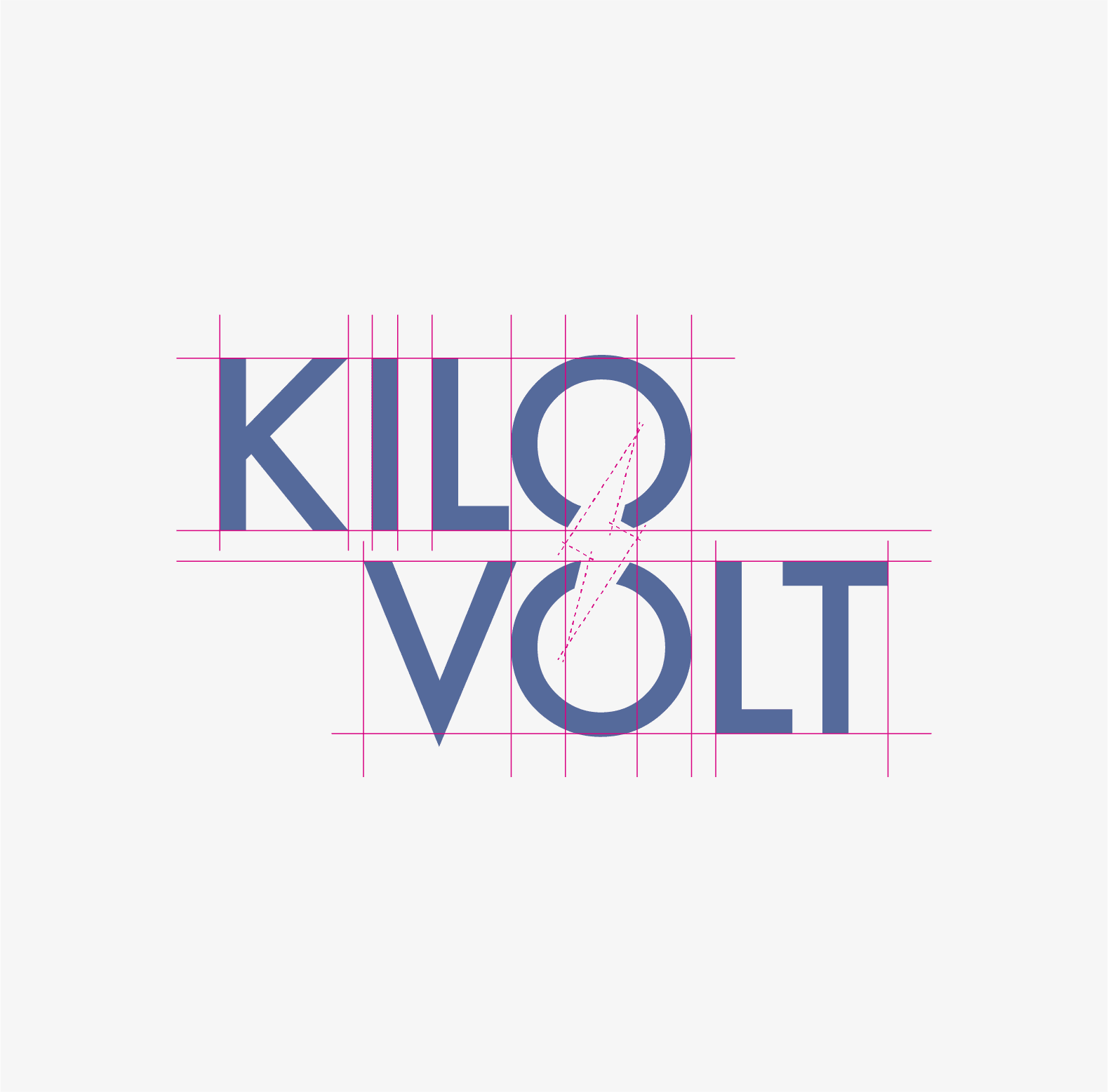

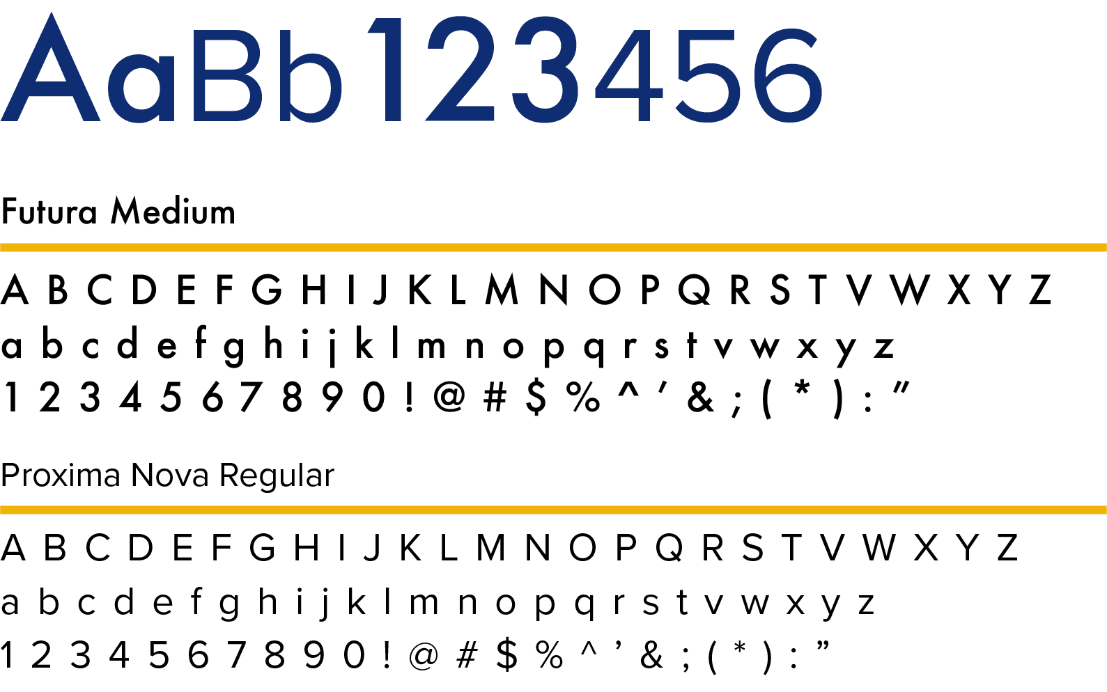
The choice of Futura Medium and Proxima Nova Regular as the primary typefaces for the brand
plays a crucial role in achieving a sharp and elegant look. Futura Medium, with its clean,
geometric lines and modern aesthetic, brings a sense of precision to the brand.
Its boldness and clarity make it ideal for headlines and key messaging, ensuring that important
information stands out with confidence.
Complementing Futura, Proxima Nova Regular offers a more approachable and versatile feel.
Its balanced proportions and smooth curves provide a softer contrast to Futura's sharpness,
adding warmth and readability to the text. Together, these typefaces create a harmonious
balance. Futura Medium delivers impact and authority, while Proxima Nova Regular maintains elegance
and accessibility. This combination enhances the brand's visual identity, making it both striking
and sophisticated, perfectly aligned with the company's ethos of innovation and quality.
