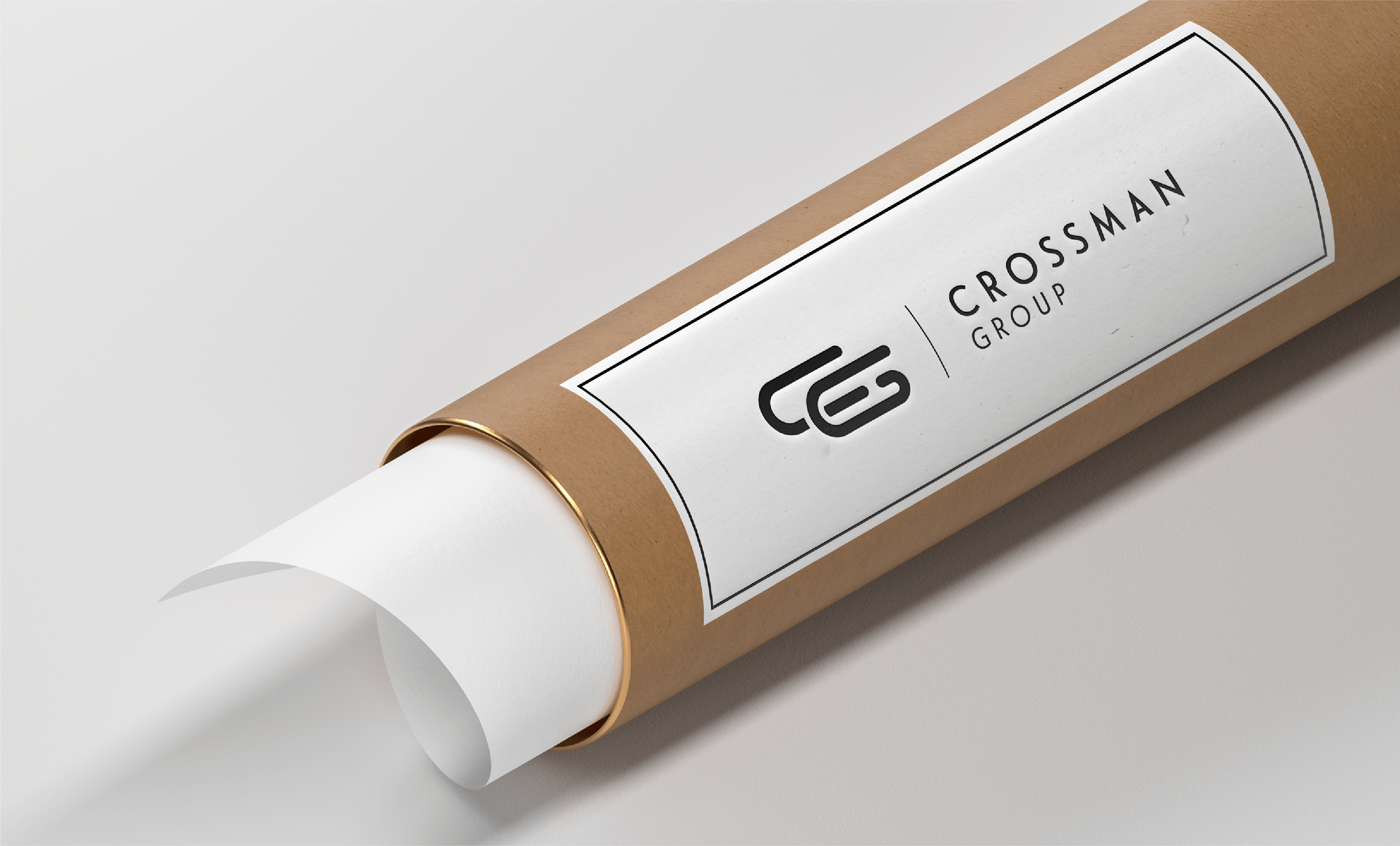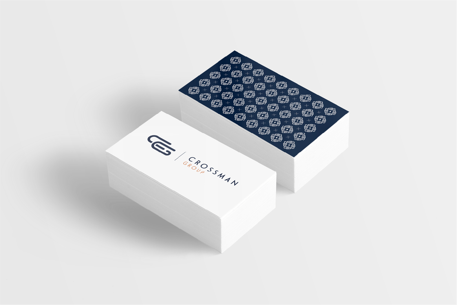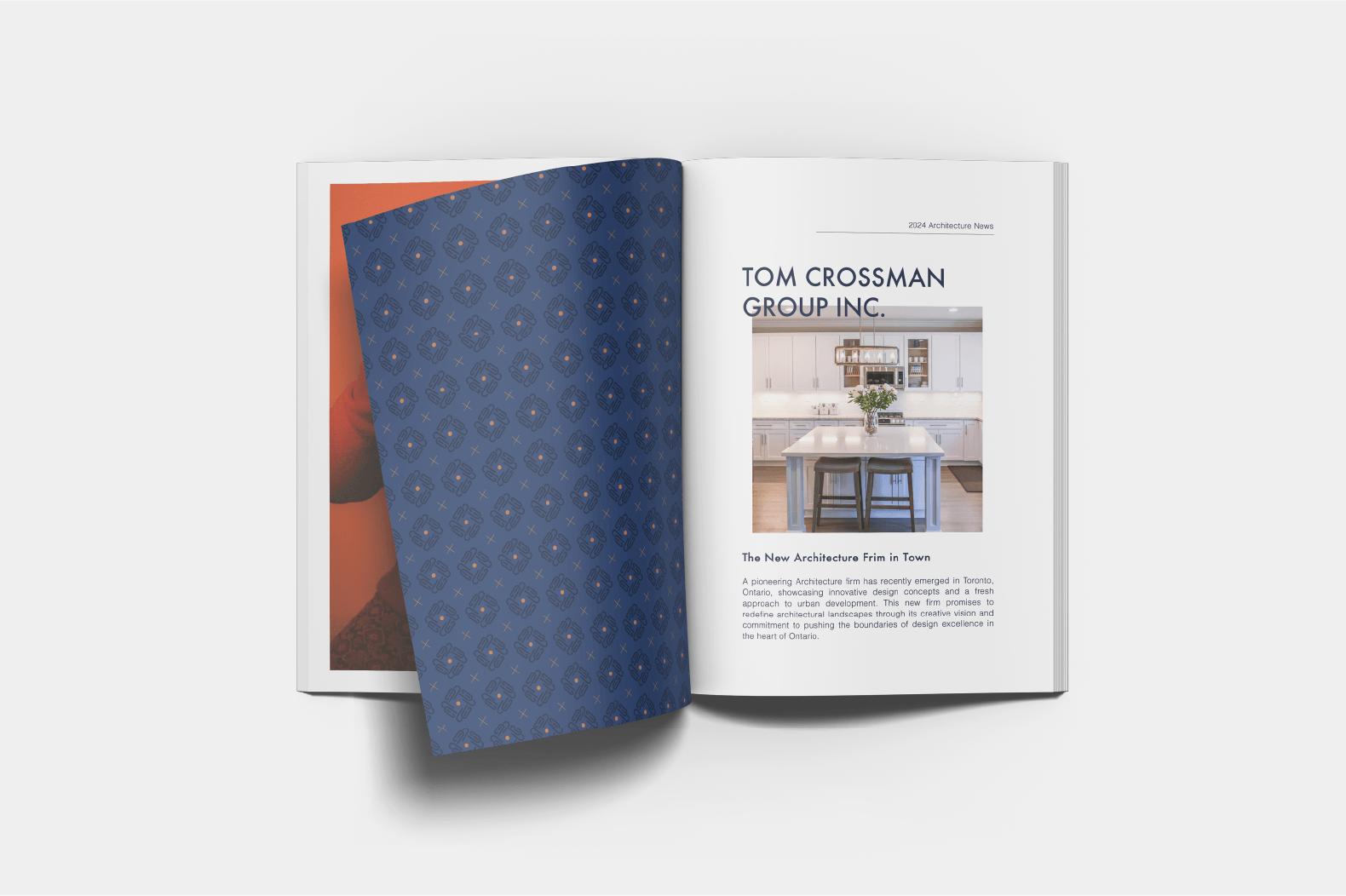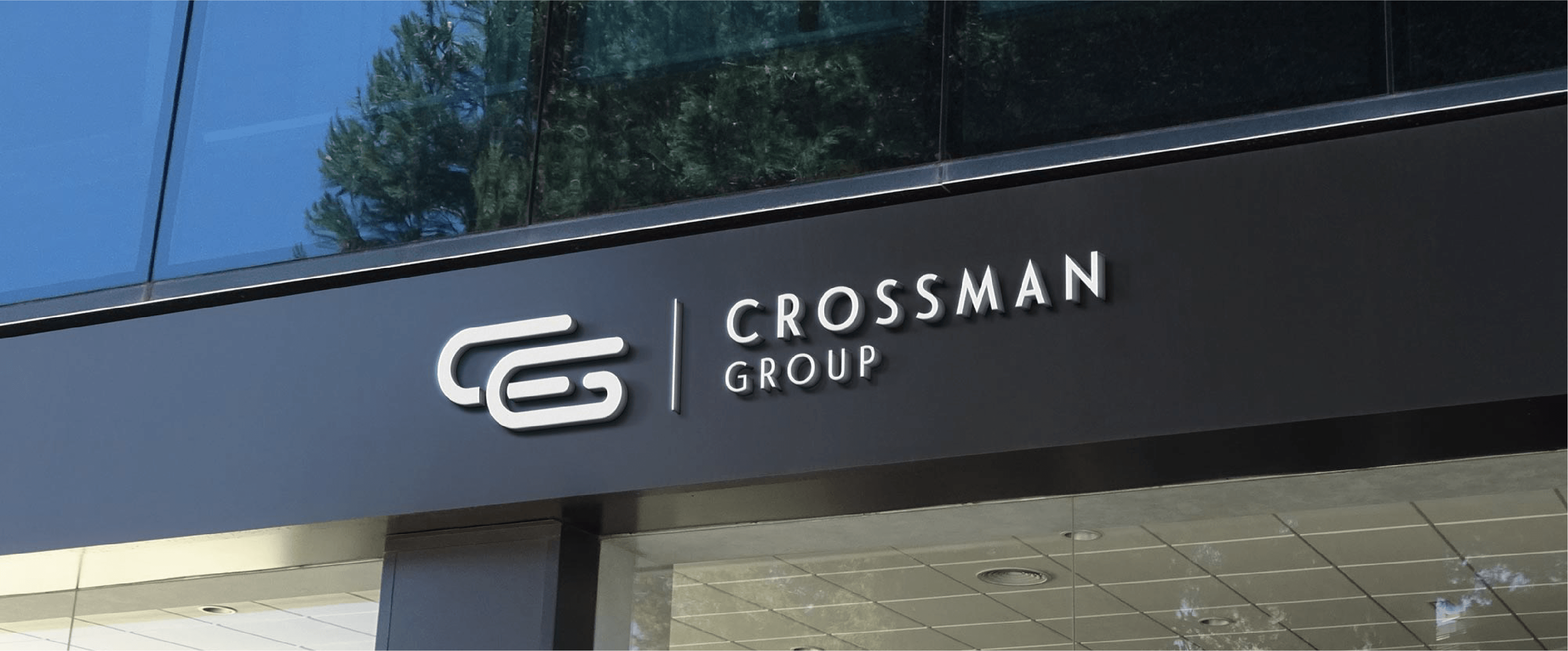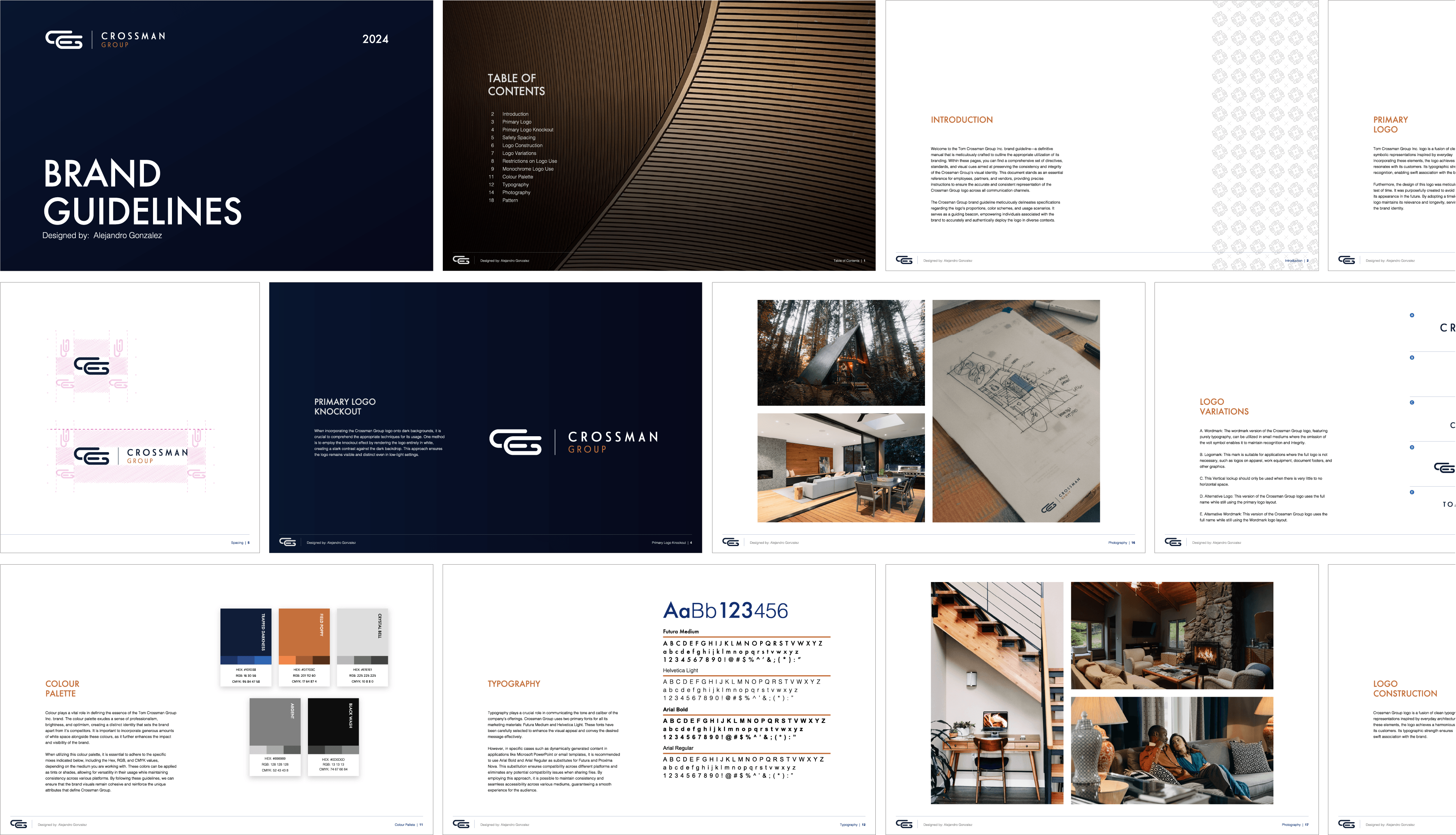

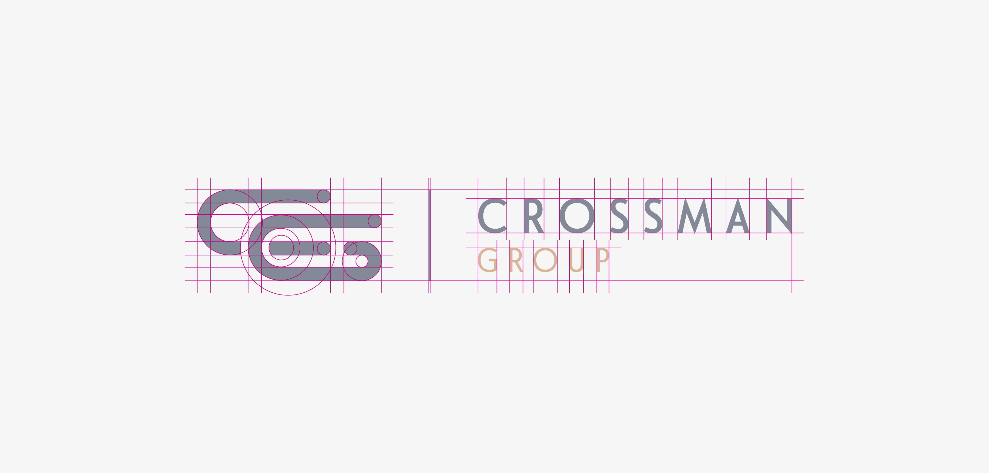
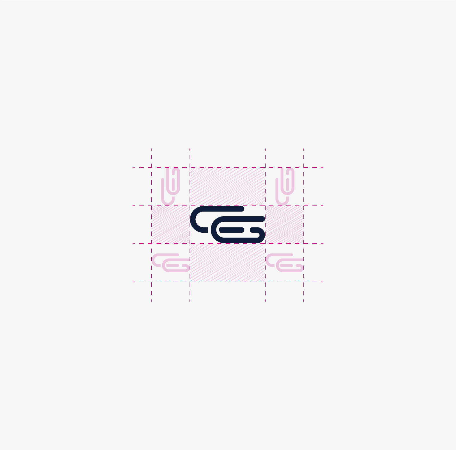
The brand identity created for Crossman Group is a harmonious blend of precision and inspiration, designed to reflect the company's core values and vision while drawing loose inspiration from the architectural philosophies of Frank Lloyd Wright and Ludwig Mies van der Rohe, two of the client’s favorite architects. Geometric shapes are employed throughout the branding to symbolize structure, stability, and professionalism, echoing the clean lines and minimalist approach of these architectural masters. The serious colour palette, featuring deep, muted tones, conveys a sense of authority, reliability, and trustworthiness, establishing a strong visual foundation. Complementing this, the imagery chosen for the brand evokes a sense of aspiration and possibility, subtly provoking the imagination and inspiring dreams.


Dark blue, orange, and shades of grey were chosen for the brand’s colour palette to create a harmonious blend of trust and reliability, represented by the dark blue; dynamic energy and creativity, symbolized by the orange; and a sophisticated, neutral foundation provided by the greys, which together establish a professional yet modern aesthetic that resonates with the brand's core values.

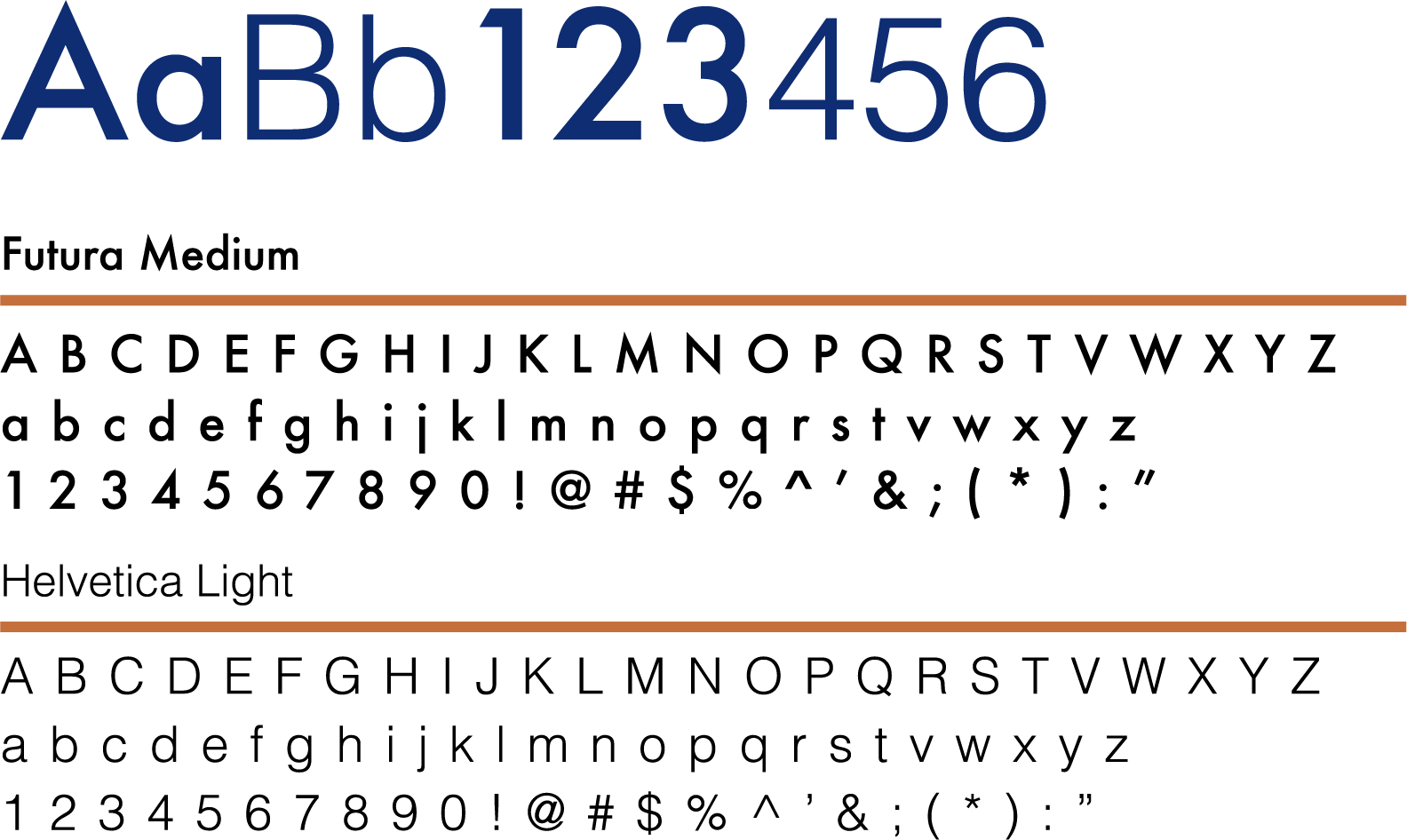
Futura Medium and Helvetica Light were chosen for their clean, modern aesthetics and legibility, with Futura Medium providing a strong, geometric presence and Helvetica Light offering a sleek, minimalistic contrast that together enhance the brand's professional and contemporary identity.
