Canada has no shortage of brands built around maple leaves, hockey, and
red-and-white imagery. Yonge Canadian was created to explore a different
side of Canadian identity.
The brand draws inspiration from the people, neighbourhoods, streets, and
cultural moments that make Canada unique. At its core, the goal was to create
a lifestyle brand that feels distinctly Canadian without being overly literal.
The name itself is rooted in Toronto. Yonge Street is one of the city's
defining streets—connecting neighbourhoods, communities, and experiences
across the city. It became the foundation for a brand that could represent
both Toronto and a broader Canadian identity.



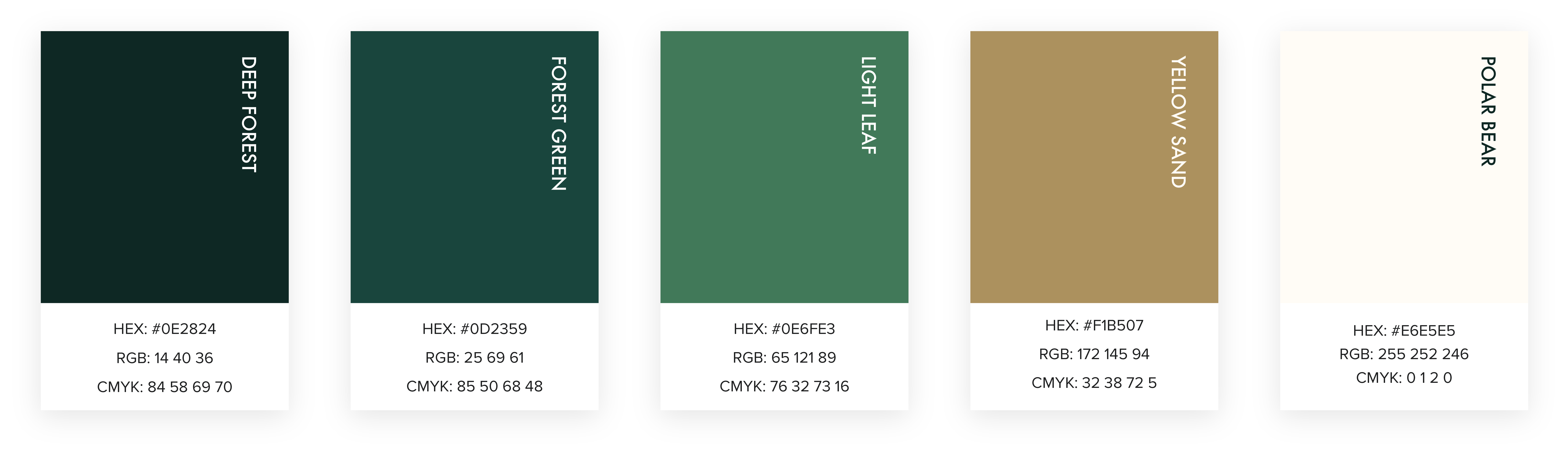
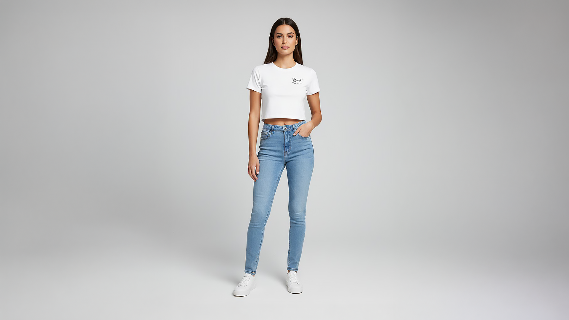
The visual language combines familiar Canadian references
with a contemporary streetwear and lifestyle aesthetic.
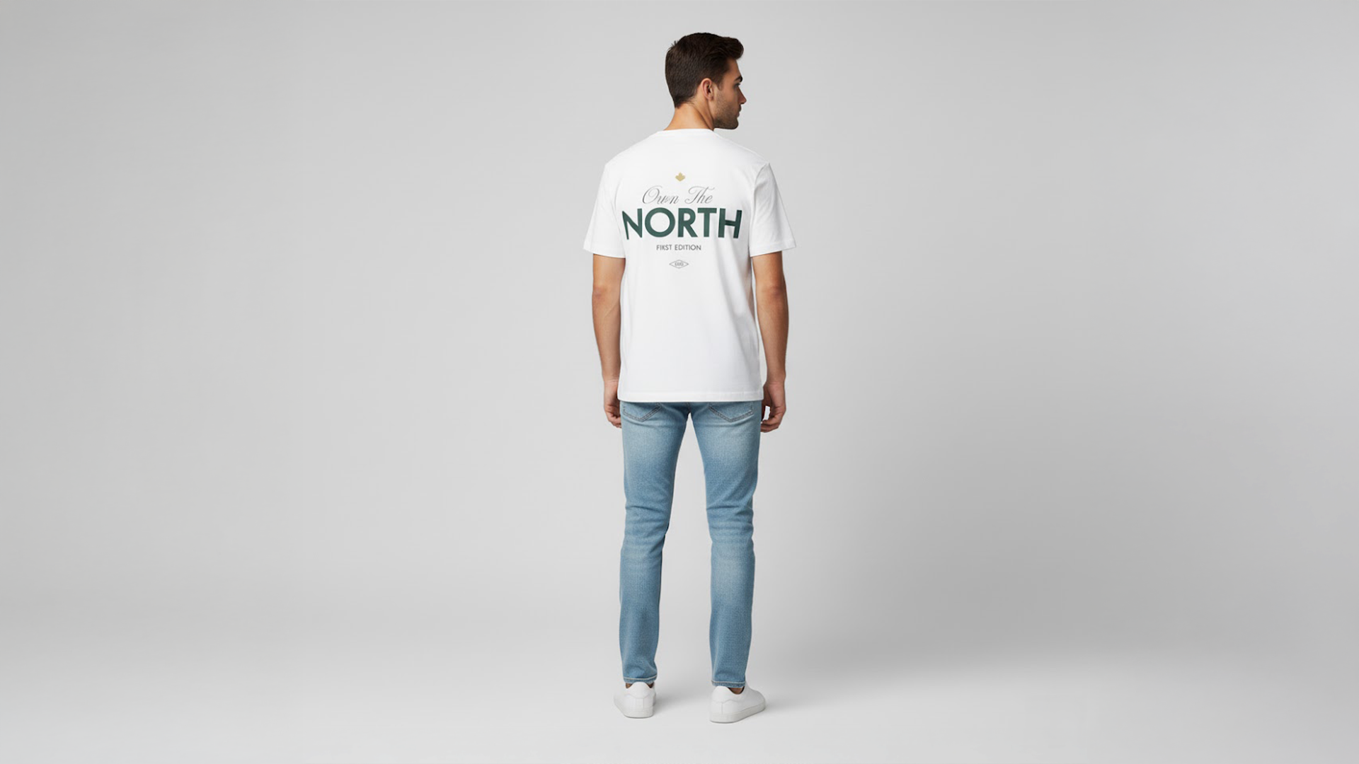
I developed the graphic direction around bold typography,
illustrative elements, unexpected compositions, and references
to Canadian culture. The intention was to create designs that
feel nostalgic and familiar while still looking fresh.
Each graphic is treated as an opportunity to tell a story—from
Toronto landmarks and Canadian symbols to cultural references
and everyday moments.
The result is a visual identity that feels Canadian without
relying on the expected visual language of Canadian branding.


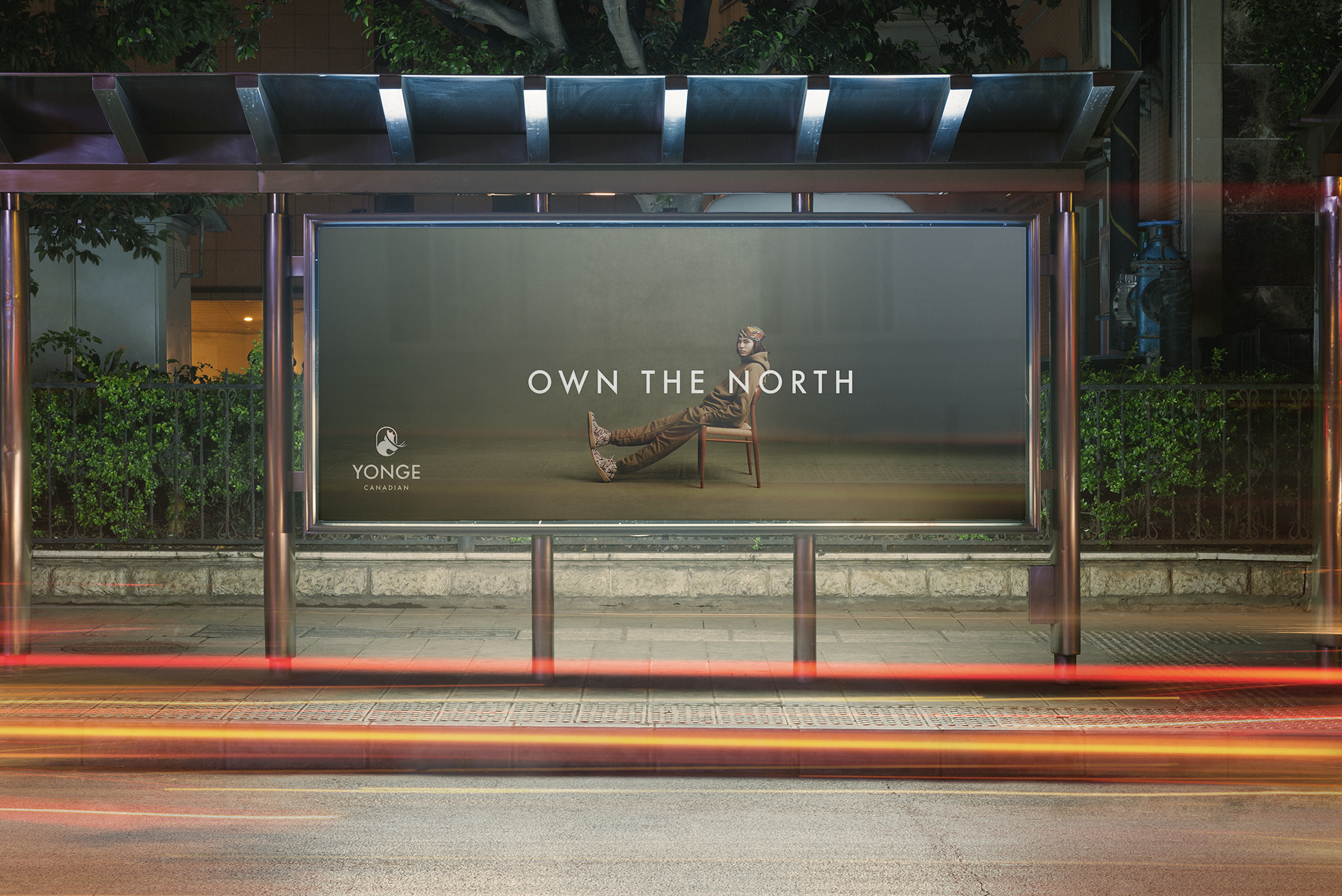
The identity was designed to live beyond the logo.
From apparel and packaging to social campaigns, photography,
digital experiences, and physical events, every touchpoint
is an opportunity to reinforce the brand.
The flexibility of the visual system allows Yonge Canadian to
move between different creative directions while maintaining
a consistent sense of identity.